4.9 盒子模型
HTML元素分为盒子元素和内联元素。从外观来看,盒子元素就是那些默认占满一行的元素,例如div,而内联元素一般都用在文本,默认是不会换行的,例如span、a
<div> 默认占满一行</div><span>可以和别的元素同一行</span><a href="#">链接也是内联元素</a>盒子元素除了自动换行外,还有什么特点呢,如下图: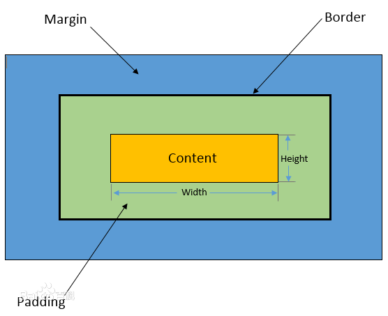
这张图展示了盒子元素
1.最里面黄色是元素的高度和宽度,width是宽度,height是高度
2.绿色部分是填充:padding
3.黑色是边框:border
4.最外面的蓝色是间距:margin
内联元素(如a、span)设置这些样式,有些是无效的。
所有元素都可以改变为盒子元素或者内联元素,display就是专门用来改变元素的:
display:block 变为盒子元素
display:inline 变为内联元素
display:inline-block 内联盒子元素,可以设置盒子元素的属性,同时不会独占一行。
display:none 元素不显示
高度height和宽度width
盒子可以设置高度和宽度,也可以只设置其中一个:
<div style="width:200px;height:200px;background:#FFF"> 长和宽都是200像素</div><div style="width:200px;background:orange"> 只设置宽度200像素</div>如果内容超过设定的高度和宽度,内容就会溢出去:
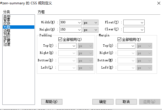
<div style="width:200px;height:50px;background:orange"> 只设置宽度100像素,高度50像素,如果内容放不下,那就溢出了</div>在Dreamweaver的CSS编辑器中,宽度和高度的设定如图所示,它在方框这个分类中,图中设定的是宽度300px,高150px:
padding填充
元素的内容在0填充的盒子元素的内部,是贴紧边界的。例如下面的div:
<div style="width:200px;height:200px;background:#FFF"> 贴近边界</div>填充padding就是把盒子变大,变大部分不能有别的内容。例如上面的例子,加了20像素的填充:
<div style="width:200px;height:200px;background:#FFF"> 我没有任何填充</div><div style="width:200px;height:200px;background:orange;padding:20px"> 我有20像素的填充</div>填充可以是四个方向的,可以一次分别设置,例如:
<div style="width:150px;background:orange;padding:20px 15px 12px 20px"> 我有20像素的填充</div>padding:20px 15px 12px 20px表示上右下左顺时针四个方向的填充值,如果上下填充相同,左右填充相同,还可以简写成这样:
<div style="width:150px;background:orange;padding:20px 15px"> padding:20px 15px表示上下填充20像素,左右填充15像素</div>此外,填充还可以单独设置某个方向:
padding-top 顶端
padding-right 右边
padding-bottom 底部
padding-left 左边
例如下面的例子是只填充左边:
<div style="width:200px;height:200px;background:orange;padding-left:20px"> 我左边有20像素的填充</div>边框border
border边框是围绕在元素周围的线条,可以用来装饰、区分元素或用来设置尺寸。例如下面的div:
<div style="width:200px;height:200px;background:#FFF;border:1px solid black"> 我有一个黑色的边框</div>上面的例子中,我们使用了border属性来设置边框。border属性支持三个值:border-width(宽度)、border-style(边框样式)和border-color(边框颜色)。它们依次设置边框的宽度、样式和颜色,这三个属性都要设置,缺少其中一个,边框就不会显示。此外,也可使用border-left、border-top等单独设置某个方向的边框。
下面是一个比较复杂的例子,展示了不同边框样式的效果:
<style>#show{ width: 200px; height: 200px; background: #FFF; border: 5px solid black; border-top-style: dashed; border-bottom-style: dotted; border-left-style: double; border-right-style: ridge;}</style><div id="show"> 不同边框样式的效果:上边框是dashed(一种虚线),左边框是双线double,右边框是立体线条ridge,但用得最多的还是实线solid</div>上述代码设置了5像素宽的黑色边框(为了看起来效果明显),并针对不同的方向使用不同的样式,包括虚线、点状线、双线条和立体线条等。你也可以设置其它的边框样式(例如:solid、groove、inset等)。总之,边框可以让元素显得更加美观和有层次感。
边框也可以只设置其中一条边,例如:
<style>#show{ width: 200px; height: 200px; background: #FFF; border: 5px black; border-top-style: solid;}</style><div id="show"> 只有顶端边框</div>边距margin
边距已经超出了盒子的长度和宽度范畴,margin边距是指盒子元素与其他元素间的空间,可以把它想象为盒子与其他盒子的距离。
margin就是盒子周围的空间,例如给上面的盒子加上20像素的margin,可以看到橙色的盒子相对于别的盒子产生了位移:
<div style="width:200px;height:200px;background:#FFF"> 参照物</div><div style="width:200px;height:200px;background:orange;margin:20px"> 不要和我太近了</div><div style="width:200px;height:200px;background:#FFF"> 参照物</div>margin可以是四个方向的,可以一次分别设置,例如:
<div style="width:200px;height:200px;background:#FFF"> 参照物</div><div style="width:150px;background:orange;margin:20px 15px 12px 20px"> 周围距离不一样</div><div style="width:200px;height:200px;background:#FFF"> 参照物</div>margin:20px 15px 12px 20px表示上右下左顺时针四个方向的距离值,如果上下距离相同,左右距离相同,还可以简写成这样:
<style>.test-div > div{ display:inline-block;}</style><div class="test-div"> <div style="width:200px;height:200px;background:#FFF"> 参照物 </div> <div style="width:150px;background:orange;margin:20px 15px"> 两边20像素,上下15像素 </div> <div style="width:200px;height:200px;background:#FFF"> 参照物 </div> <div style="width:200px;height:200px;background:#FFF"> 参照物 </div> <div style="width:200px;height:200px;background:#FFF"> 参照物 </div> <div style="width:200px;height:200px;background:#FFF"> 参照物 </div></div>margin-top 顶端
margin-right 右边
margin-bottom 底部
margin-left 左边
例如下面的例子是只设置右边的距离:
<style>.test-div{ display:inline-block;}</style><div class="test-div" style="width:200px;height:200px;background:orange;margin-right:20px"> 距离右边元素20个像素</div><div class="test-div" style="width:200px;height:200px;background:#FFF"> 参照物</div>margin还可以是负值,效果就是反方向位移,下面的代码,margin-right使用了负值-50px
<style>.test-div{ display:inline-block;}</style><div class="test-div" style="width:200px;height:200px;background:orange;margin-right:-50px"> 距离右边元素20个像素</div><div class="test-div" style="width:200px;height:200px;background:#FFF"> 参照物</div>最后,margin还有一个常用的技巧,块的居中。text-align只能用在元素内部的居中,例如p元素内部,如果p元素本身就要居中,就只能用margin了。有两个因素一起作用:
1.要居中的块必须有宽度
2.块的左右margin值设置成auto(自动),通常是这样写margin:0 auto (上下边距0,左右边界auto)
<style>.test-div2{ padding:20px;}</style><div class="test-div2" style="width:150px;height:200px;background:orange;"> 没有居中</div><div class="test-div2" style="width:150px;height:200px;background:red;margin:0 auto"> margin的左右设置成auto,就是div的居中效果</div>